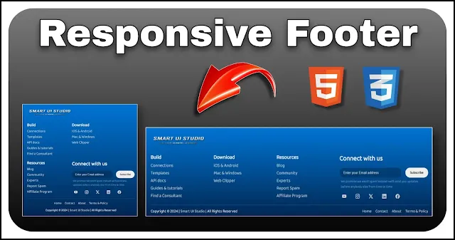
Create a Modern Responsive Footer using HTML and CSS
A footer is a key component of any website, often containing essential links, contact information and social media icons. A well-designed footer enhances user navigation and adds to the overall aesthetics of your site. It's a critical element for improving user experience, offering quick access to important resources and maintaining brand consistency. Creating a stylish and functional footer for your website is crucial for user experience and brand consistency. In this tutorial, we'll guide you through building a modern footer using HTML, CSS and Bootstrap Icons.
In this guide, we will show you how to create a responsive footer using HTML and CSS that not only looks great but also provides useful information to your visitors. This footer will include multiple sections, all presented in an organized and visually appealing manner.
Also Read: Create an Expandable Sidebar Menu using HTML CSS and JS
By the end of this tutorial, you'll have a footer that's easy to integrate into any web project, adapting seamlessly to various screen sizes for optimal usability on both desktop and mobile devices. We'll cover the HTML structure, CSS styling and how to use Bootstrap Icons to enhance the visual appeal of your footer. Let's get started on creating a footer that not only complements your website's design but also enhances its functionality and user experience.
HTML Structure
We'll begin by setting up the basic HTML structure for our footer. This includes creating sections for branding, useful links, newsletter subscription form and copyright section.
<footer>
        <div class="footer-wrapper">
            <div class="brand-logo"><img src="https://i.ibb.co/DMMjcm6/logo.png" alt="Logo"></div>
            <ul>
                <li>
                    <h3>Build</h3>
                </li>
                <li><a href="#">Connections</a></li>
                <li><a href="#">Templates</a></li>
                <li><a href="#">API docs</a></li>
                <li><a href="#">Guides & tutorials</a></li>
                <li><a href="#">Find a Consultant</a></li>
            </ul>

            <ul>
                <li>
                    <h3>Download</h3>
                </li>
                <li><a href="#">iOS & Android</a></li>
                <li><a href="#">Mac & Windows</a></li>
                <li><a href="#">Web Clipper</a></li>
            </ul>

            <ul>
                <li>
                    <h3>Resources</h3>
                </li>
                <li><a href="#">Blog</a></li>
                <li><a href="#">Community</a></li>
                <li><a href="#">Experts</a></li>
                <li><a href="#">Report Spam</a></li>
                <li><a href="#">Affiliate Program</a></li>
            </ul>

            <div class="connect-with-us">
                <h2>Connect with us</h2>
                <div class="newsletter">
                    <form>
                        <input type="email" id="email-id" placeholder="Enter your Email address">
                        <button class="submit">Subscribe</button>
                    </form>
                    <p>We promise we won't spam instead we'll send you updates before anybody else from time to time</p>
                </div>
                <ul class="social-media">
                    <li><a href="#" class="bi bi-youtube"></a></li>
                    <li><a href="#" class="bi bi-instagram"></a></li>
                    <li><a href="#" class="bi bi-twitter-x"></a></li>
                    <li><a href="#" class="bi bi-linkedin"></a></li>
                    <li><a href="#" class="bi bi-facebook"></a></li>
                </ul>

            </div>

            <div class="flex-c">
                <div class="copyright">Copyright © 2024 | <a href="#">Smart UI Studio</a> | All Rights Reserved</div>
                <ul class="pages-link">
                    <li><a href="#">Home</a></li>
                    <li><a href="#">Contact</a></li>
                    <li><a href="#">About</a></li>
                    <li><a href="#">Terms & Policy</a></li>
                </ul>
            </div>
        </div>
</footer>
In the branding section, we include the logo of our brand along with the brand name. This helps in reinforcing brand identity and makes the footer visually attractive.
- We have categorized the useful links into three sections.
- This section encourages users to subscribe to the newsletter, promising no spam and timely updates. The form includes an input field for the email address and a subscribe button.
- Social media links are displayed with icons for YouTube, Instagram, Twitter, LinkedIn, and Facebook. These icons are styled for a cohesive look and ensure users can easily connect with us on various platforms.
- At the bottom of the footer, we include copyright information and additional navigation links for home, contact, about, and terms & policy. This section is crucial for legal purposes and provides additional navigation options.
Styling the Footer with CSS
To style the footer, we use a combination of CSS properties, including grid layout, flexbox, and custom styles for each section of the footer. Define a dark background with a gradient effect and ensure that text and links are easily readable.
@import url(https://fonts.googleapis.com/css2?family=Baloo+Bhai+2:wght@400&display=swap);
@import url(https://cdn.jsdelivr.net/npm/bootstrap-icons@1.11.3/font/bootstrap-icons.min.css);

body {
    display: flex;
    min-height: 100vh;
    justify-content: center;
    align-items: flex-end;
    font-family: 'Baloo Bhai 2';
    background: #0a0a0a;
}

a {
    text-decoration: none;
    color: #cecece;
    white-space: nowrap;
}

a:hover {
    color: #ffffff;
}

ul {
    list-style: none;
}

footer {
    width: 100%;
    background: linear-gradient(#0075d5, #022651);
    color: #e8e8e8;
}

.footer-wrapper {
    display: grid;
    max-width: 1080px;
    gap: 15px;
    padding: 25px 10px 10px;
    grid-template-areas: "brand brand brand brand"
        "list1 list2 list3 newsletter"
        "bottom bottom bottom bottom";
    margin: 0 auto;
    grid-template-columns: repeat(3, 1fr) 1.5fr;
}

.brand-logo {
    font-size: 22px;
    grid-area: brand;
    font-weight: 600;
    margin-bottom: 10px;
}

.brand-logo img {
    height: 40px;
    filter: drop-shadow(2px 2px 1px #2f2f2f);
    vertical-align: middle;
}

.connect-with-us {
    display: grid;
    gap: 8px;
    grid-area: newsletter;
    grid-template-rows: repeat(3, max-content);
}

.newsletter {
    margin-top: 5px;
    color: #ffffff63;
}

.newsletter p {
    padding: 5px;
    font-size: 12px;
    line-height: 1.5;
}

form {
    display: flex;
    gap: 15px;
}

#email-id {
    width: 100%;
    border: none;
    outline: none;
    line-height: 2;
    color: white;
    font-size: 12px;
    padding: 5px 15px;
    border-radius: 30px;
    background: #00000038;
}

#email-id::placeholder {
    color: #dcdcdc;
}

.submit {
    font-family: 'Baloo Bhai 2';
    background-color: #ededed;
    border: none;
    color: black;
    padding: 4px 18px;
    font-weight: 600;
    border-radius: 20px;
    font-size: 12px;
}

.social-media {
    display: flex;
    gap: 30px;
    align-items: center;
    padding: 0 10px;
}

.flex-c {
    display: flex;
    justify-content: space-between;
    grid-area: bottom;
    padding-top: 10px;
    text-align: center;
    font-size: 14px;
    border-top: 1px solid #ffffff2b;
}

.pages-link {
    display: flex;
    gap: 15px;
}

@media screen and (max-width:880px) {
    .footer-wrapper {
        grid-template-areas: "brand brand"
            "list1 list2"
            "list3 newsletter"
            "bottom bottom";
        grid-template-columns: 1fr 1.5fr;
        padding: 20px;
    }
}

@media screen and (max-width:680px) {
    .flex-c {
        flex-direction: column-reverse;
        align-items: center;
        gap: 10px;
    }
}

@media screen and (max-width:500px) {
    .footer-wrapper {
        grid-template-areas: "brand brand"
            "list1 list2"
            "list3 list3"
            "newsletter newsletter"
            "bottom bottom";
        gap: 25px;
        grid-template-columns: 1fr auto;
    }
}- Used a grid layout to organize the footer content into four main areas: brand logo, navigation links, newsletter subscription, and social media icons.
- Used flexbox to align items within each section and ensure proper spacing.
- Customize the appearance of the newsletter subscription form and social media icons to match the overall design theme.
- To ensure the footer looks great on all devices, add media queries to adjust the layout for different screen sizes. For example, stack the elements vertically on smaller screens and maintain a horizontal layout on larger screens.
Also Read: Create a User-Friendly and Responsive Sign Up Form using HTML & CSS

